End game interactive narrative

I saw this posted to the Interactive Narrative Linkedin group. The project is a nice addition to a TV series. An online adventure that uses Facebook – you see one of your friends kidnapped then you help solve the crime. The detective and characters from the show address you directly. The puzzle solving is very simple with lots of hints and help built-in. The puzzles follow the familiar assemble photo’s, look at a computer desktop, click on objects in a room. But the drawing of images from you Facebook friends, although an old trick, is nicely done and has a touch of humour. Overall this is pitched perfectly as a quick enjoyable adjunct to the TV show. It makes me wish Facebook connect had been around when we made the ARG Jamie Kane and the online drama Signs of Life for the BBC.

[youtube=http://www.youtube.com/watch?v=uFaFcYFkFVc]

Endless distraction with the new

A timely thought piece… well I read the first paragraph, but had to check Facebook…

“We are in great haste,” wrote Thoreau in 1854, “to construct a magnetic telegraph from Maine to Texas; but Maine and Texas, it may be, have nothing important to communicate.” And today, we are in great haste to celebrate something going viral, but seem completely unconcerned whether the thing that went viral added one iota of anything good…

From an article by Arianna Huffington in the Guardian. “Virality uber Alles: what the fetishisation of social media is costing us all”

Conversation not registration

My friend Eric M came to work with a great idea. Instead of registration to a website – where a punter is asked a load of questions in a form. You engage then in a conversation and ask for only the information you need at the point that seems relevant to the user. For example if it’s a game site you ask for a name to use so they can play a game. When the player wins you ask for an email address so you can send them their prize or so they can share their score. When they lose you ask for their email address to send them more tokens or chips so they can play again. Hence my condensation of this idea as a conversation instead of registration.

Another step towards a safer internet

The latest incarnation of the controls that governments and corporations are attempting to put in place is SOPA. This seems like another faltering step towards a Team America style policing of the World Wide Web. This takes me back to the mid nineties when I saw the first web browsers and the speed with which commercial interests scrabbled to work out how they could exploit it. I thought that eventually cyber space would reflect real space. In the way that towns have ‘safe’ centres packed with chain stores and advertising. The outer edges sometimes has the quirkier, left-field places. At the time I was studying interactive media and, rather than write an essay, decided to create an interactive story. It was called Infinet.
Infinet stores

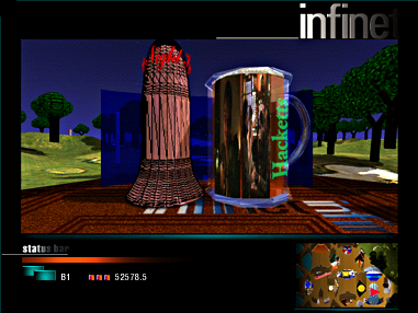
I created Infinet with four fellow students. We mashed-up brands – the giant pink tower was for Glaxo-Welcome with a Coke style ribbon logo and jingle. We had a confessional, a bank and a store selling Nike Air – flavoured air in breathable capsules. A visitors’  movement around this space was very limited to basic left and right panning and pre-rendered steps forward.

But there were cracks hacked into the veneer of Infinet. A visitor might stumble upon a bit of graffiti or lift a manhole cover. If they did they would find themselves in an endlessly spiraling vortex of unmediated spaghetti that represented the weird and wonderful, individual, quirky, sick and human web that we currently know. The way the visitor moved around this space was free-flowing. They could scroll, swoop and dive any which way they liked. I wanted to compare the narrow options of movement in Infinet which was like all the “interactive” options around at that time. It struck me as odd that a button that did something was referred as adding interactivity. For me all this did was react. The narrow corridor of pre-defined and pre-rendered “interaction”  (Myst et al) also rang false. So the comparison between the way a visitor moved was part of my idea to begin to explore the notion of what interactive meant.

Some additionally playful elements we added was a Status bar that displayed your status using marketing (socio-economic) categorys such as B1 or D4. The project was successful and we won a place at the New Talent Pavilion at Milia ’97. I got to fly business class to Cannes and show Infinet to 1,500 of the good and the great of new media in the same hall that they present the film awards.

We built Infinet while studying for MA Design for Interactive Media (DIM) at Middlesex University. The project was assembled in Director 5, coded in Lingo with the models and fly-through in Strata 3D.


Child’s play – children learning from playing games

I saw this “games based learning” initiative from up north.  One of the contributors mentions how much ‘we’ learnt from playing hopscotch as children. I think this is missing the point about the both the IT, cognitive and creative skills that can be developed by well designed games.

Roar cbbc game

An example of a successful 'learning through play' type of game. Developed at Endemol by myself and Matt Burton McFaul, for CBBC

Tokens with value

I was waiting for train on Earls Court station this morning. A man sitting on a bench sat holding, in both hands, a small slip of pink, slightly crumpled, paper. It was a print out that you get from a newsagent with your lottery numbers on. He stroked the edge of the paper looking intently at it. It seemed as if he was running through the numbers, possible important numbers to him (his daughter’s birthday, his first flat?). The fascination and concentration that held him reminded me of the power we can give to simple tokens. Quite ordinary looking things can be endowed with huge significance. We are surrounded by more hyper graphics in video advertising hoardings, mobile application, etc. It felt good to be reminded that this is not always necessary.

Usability the problem of testing in labs

While reviewing usability tools and looking at the best way to test mobile (cell phone) apps I came across this handy summary that sums up how I feel about lab testing.

“Usability researchers and practitioners have been concerned that laboratory evaluations do not simulate the context where mobile phones are used (Johnson 1998) and lack the desired ecological validity. Interruptions, movement, noise, multitasking etc. (Tamminen et al. 2004) that could affect the users’ performance are not present in laboratory tests. The surrounding environment and mobility are assumed to set special requirements for mobile applications. Usability testing should take these requirements into account.”

Although the conclusion of this paper is that when testing mobile applications you will identify all the issues. The thing you will miss is the incidental observations about user behaviour – stepping out of a crowd to do complex tasks – but nothing that would effect the identification of problems the user has your application.

Usability Testing of Mobile Applications: A Comparison between Laboratory and Field Testing

Dark Patterns

A well explained and compelling presentation at http://wiki.darkpatterns.org/Home on how some organisation exploit UX in unethical ways. It is fascinating to see how incompetence and dumb luck in terms of web form design is evolving. As we gain understanding of the psychological and cognitive processes people are learning how to exploit misunderstanding and trust. The humble web form becomes a muggers paradise.

The line between encouraging people to do what you want and tricking them into doing things that they don’t want to is very grey. As DarkPatterns.org explain many companies will have a poor moral compass and without pressure from outside. For example shoddy tricks to make company websites appear higher up search engine results are only kept to a minimum because the search engine software is regularly updated to punish people that seek to ‘cheat’ their way to the top. There is no equivalent in terms of UX. I think the only that companies can be dissuaded from making ££££s with little effort is to publicly name and shame them. When the use of dark patterns is seen as the confidence trick that it is we have some hope of limiting there use to murkier areas of the interweb.